
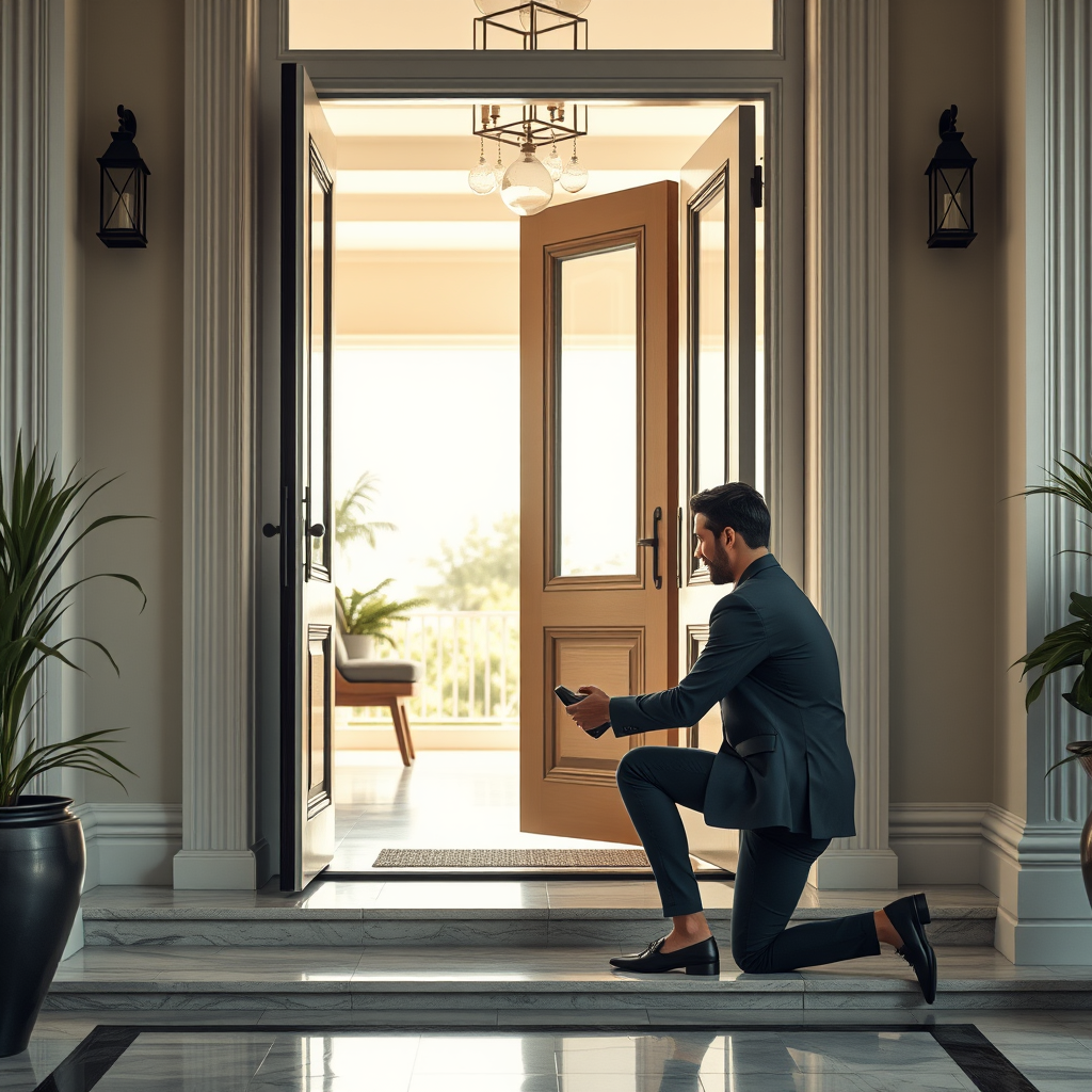
Ultra-realistic 4K photo, modern elegant home entrance, open front door. A woman in a beautiful white dress stands on the indoor doorstep, looking at a kneeling man who gently puts a shoe on her extended foot. Natural daylight, sharp focus, beautiful details, modern style, no vintage look, no painting.
BRAND PROOFS · EXACT CREATIVE BRIEFS
Logo Ideas from Real Visitor Prompts
Browse eligible logo concepts shared by FreeLogo visitors, see the exact creative briefs, and make your own version.
Browse 5765 real creationsCOMMUNITY OUTPUTS · EXACT PROMPTS
All visitor creations
Showing 217–240 of 5765. No stock examples or system defaults. Choose a tool, study a real result, then reopen its prompt as your starting point.
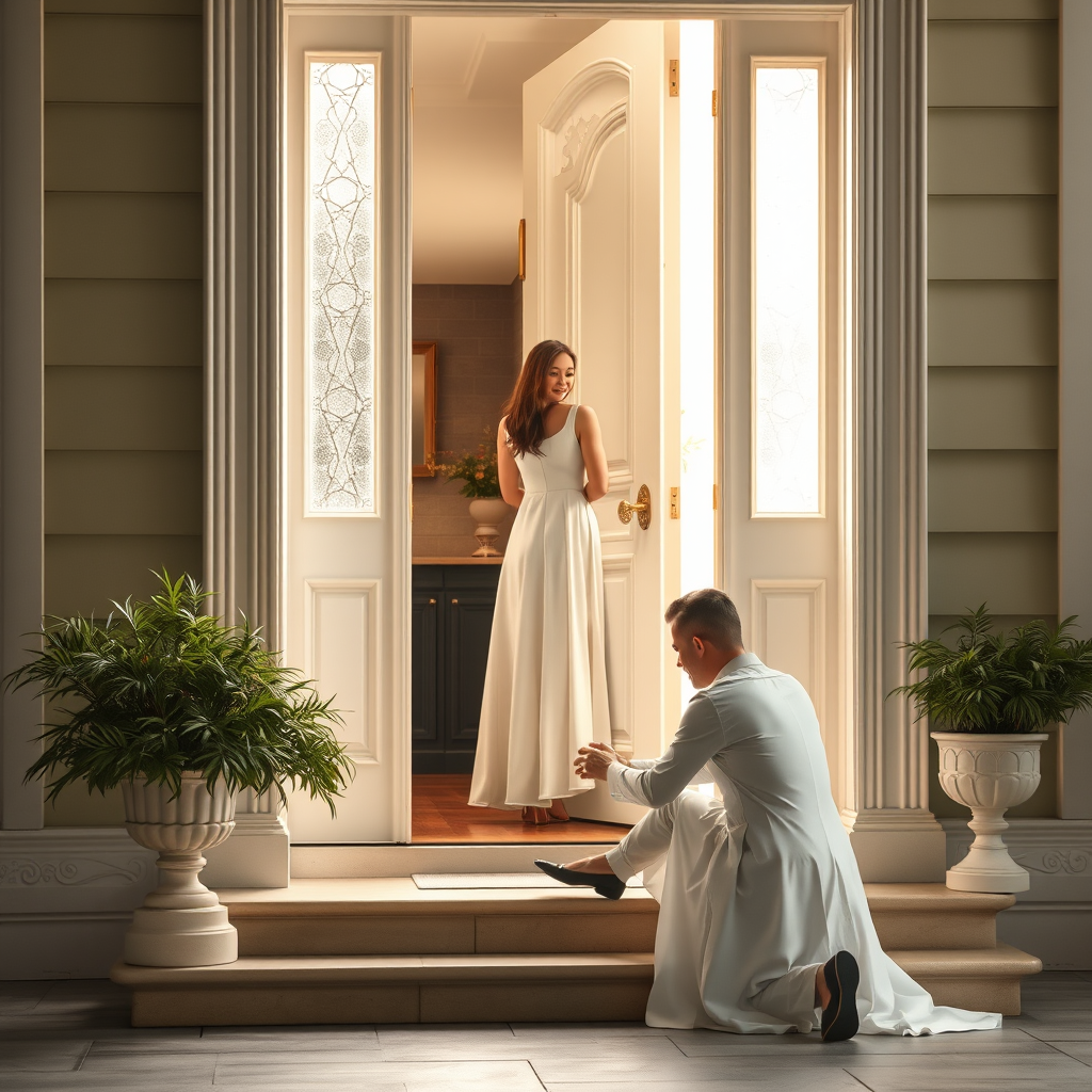
Inside the house, just as the door opens, a woman in a white dress stands on the entrance step while a man kneels to put on her shoe. Beautiful, realistic, high-resolution image, soft lighting, elegant and spiritual atmosphere.
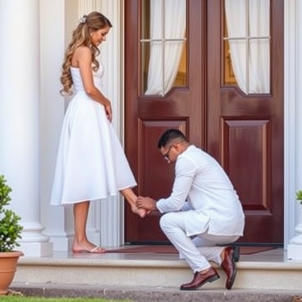
A woman in a white dress stands on the doorstep as a man kneels to put on her shoe, symbolizing love, devotion, and respect.
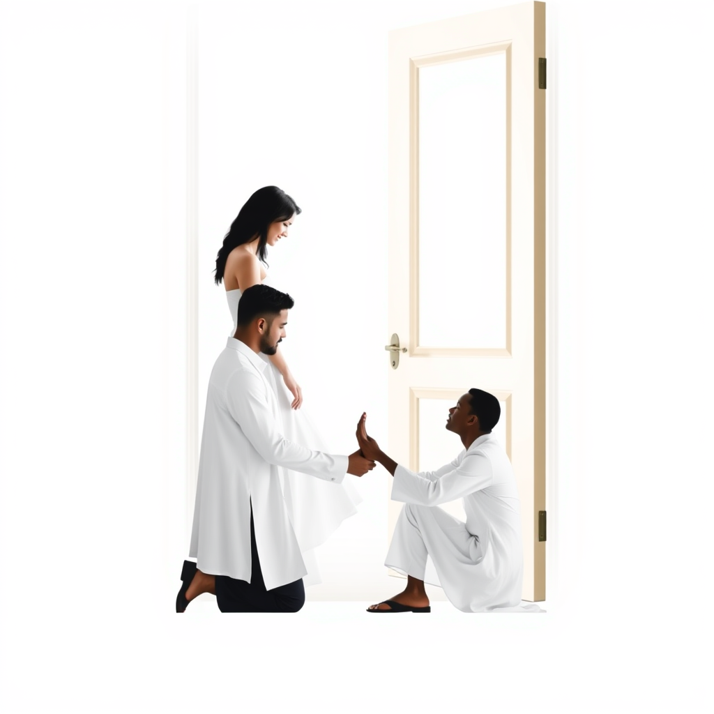
A woman in a white dress stands at a doorway, looking at a kneeling man as she extends her foot toward him while he puts on her shoe. A spiritual symbol of love, devotion, humility, and respect. Elegant, minimalist logo design.
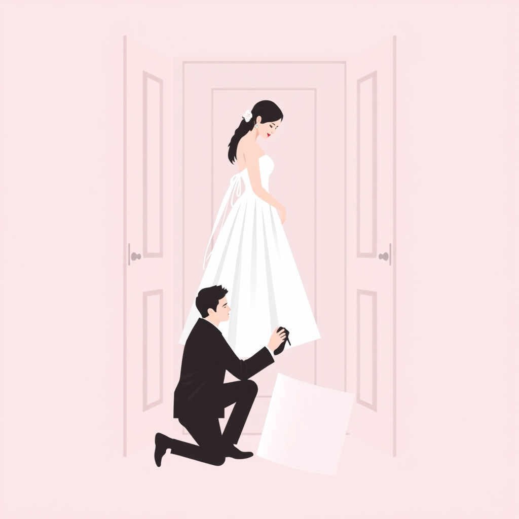
A woman in a white dress standing at a doorway while a man kneels to put on her shoe, symbolizing love, devotion, respect, and tenderness. Elegant, romantic, minimalist logo design.
LEX-Ω | PREMIUM MINIMALIST VECTOR LOGO DESIGN ROLE: Act as a world-class brand identity designer, luxury fragrance branding strategist, minimalist logo specialist, and professional vector graphics designer. 1. BRAND IDENTITY Brand Name: ELEGO Arabic Name: إيليقو Industry: Premium unisex perfumes and fragrance products. Brand Personality: Minimal, elegant, confident, refined, timeless, trustworthy, modern, and distinctive. Brand Essence: Quiet luxury with a memorable personal signature. Emotional Objective: Make the audience feel confidence, sophistication, individuality, and understated luxury. 2. DESIGN OBJECTIVE Create an original, professional, minimalist VECTOR logo for ELEGO that communicates premium fragrance positioning through simplicity, precision, and visual confidence. The logo must look sophisticated without being complicated, luxurious without being flashy, and memorable without relying on generic perfume imagery. Prioritize a distinctive visual identity that can become recognizable across perfume bottles, caps, packaging, labels, social media, and future fragrance collections. 3. LOGO CONCEPT Explore a refined custom wordmark using the exact spelling: ELEGO Develop a subtle, intelligent typographic signature by customizing one or two letterforms, particularly E or G, if this improves distinctiveness. Optionally explore a simple geometric monogram combining E and G as a secondary brand symbol. The symbol must be abstract, balanced, geometrically precise, and recognizable at small sizes. Do not force a droplet, flower, crown, or perfume bottle into the design. Use symbolism only if it strengthens the brand concept. The Arabic name إيليقو may be presented as a separate complementary wordmark, using accurate Arabic typography and correct letterforms. 4. COLOR PALETTE — STRICTLY CONTROLLED Use the following brand colors: - Charcoal Black: #20201F — primary logo color. - Muted Champagne: #D5C2A0 — restrained accent or premium packaging ap
make a logo for my youtube channel named as PointMotion, on this channel ill post video releated cars, either they are car detailing videos, car review videos or anytype, do not refer to any cars or either of my content in the logo, the logo must be mature
Design a bold custom wordmark for PANONIAN, a modern motorcycle accessories manufacturer. Strong condensed sans-serif typography, subtle industrial detailing, precise letter spacing, confident and rugged but refined, black lettering on a warm sand beige background. The word PANONIAN must be spelled correctly. Flat vector, no gradients, no decorative scenery, no mockup.

Create a distinctive abstract emblem for PANONIAN, a premium adventure motorcycle accessories brand. Strong angular geometry, balanced proportions, subtle mechanical inspiration, bold simple shapes, modern industrial identity, black on a warm beige background. Memorable, original-looking, scalable and suitable for engraving or cutting from sheet metal. No literal motorcycle, no mountains, no roads, no animals.
Minimalist industrial logo for PANONIAN, a European motorcycle accessories manufacturer. Bold geometric symbol, angular shapes, mechanical precision, rugged premium identity, black and warm sand beige, flat vector design, clean silhouette, suitable for laser cutting metal. No gradients, no 3D, no mockups.

emblem logo of ## AI Design Prompt: Being Pure Light — Emblem & Favicon **Design a refined, original emblem for “Being Pure Light,” a Raja Yoga meditation app inspired by inner peace, soul consciousness, purity and the eternal point of light.** ### Core Symbol Create a minimalist, symbolic emblem centred on a **single point of pure white light**, representing the eternal soul. Surround it with carefully balanced geometric forms or subtle concentric circles, suggesting radiance, spiritual awareness, stillness and the return to one's original state of purity. The emblem may subtly incorporate a lotus-inspired geometry or a luminous halo, but avoid literal religious imagery. The design should feel timeless, meaningful and recognisable rather than decorative. ### Visual Style - Minimalist, sacred geometry meets modern luxury wellness branding. - Elegant, symmetrical geometry with precise proportions and intentional negative space. - A calm, luminous, ethereal quality without excessive glow or visual effects. - Sophisticated, clean vector-style shapes with crisp, clearly defined edges. - Contemporary and universal, appealing to a diverse international audience. - Inspired by stillness, clarity, the subtle soul and inner radiance. ### Colour Palette - Deep midnight blue or rich indigo as the primary background. - Pure white or soft ivory for the central point of light. - Optional subtle champagne gold accents, used sparingly. - The emblem must also work perfectly in a single colour and on a plain white background. ### Composition - Create a standalone emblem only, with no text, lettering, initials or wordmark. - Use a centred, balanced composition within a square canvas. - Ensure the symbol remains distinct at very small sizes, including a 16 × 16 px browser favicon and a 48 × 4 , intricate crest seal badge design, symmetrical emblem, detailed border ornament, flat vector logo, centered composition, solid white background, high contrast, professional brand identity
Make a logo for "RIO" market. include both "rio" and "market". and include a cup of coffee with steam. Must use lightblue background. everything else is up to you. make it clean. premium. never put something in the middle letter R I and O must stay connected. they must be visible R I and O letters must be obvious. use brown white and maybe yellow or orange only. MUST SAY RIO
Make a logo for "RIO" market. include both "rio" and "market". and include a cup of coffee with steam. Must use lightblue background. everything else is up to you. make it clean. premium. never put something in the middle letter R I and O must stay connected. they must be visible R I and O letters must be obvious. use brown white and maybe yellow or orange only
Make a logo for "RIO" market. include both "rio" and "market". and include a cup of coffee with steam. Must use lightblue background. everything else is up to you. make it clean. premium. never put something in the middle letter R I and O must stay connected. they must be visible R I and O letters must be obvious
Make a logo for "RIO" market. include both "rio" and "market". and include a cup of coffee with steam. Must use lightblue background. everything else is up to you. make it clean. premium. never put something in the middle letter R I and O must stay connected
Make a logo for "RIO" market. include both "rio" and "market". and include a cup of coffee with steam. Must use lightblue background. everything else is up to you. make it clean. premium.
Pozadina: Pozadina je svijetlo plave, tirkizne boje. Glavni logotip/tekst: U središtu slike nalazi se naziv "RIO" ispisan velikim, tamnosmeđim slovima u klasičnom serifnom fontu. Grafički detalji u tekstu: Unutar kruga ispod središnjeg natpisa nalazi se i riječ "MARKET" ispisana manjim, također tamnosmeđim slovima koja prate kružnu liniju. Kružni okvir: Cijeli središnji motiv okružen je isprekidanim kružnim prstenom sastavljenim od malih svijetlih/bijelih točkica. Mora da ima i soljica kafe nedje gdje para ide gore negdje
Create a unique, creative, professional logo for a store named "RIO MARKET". You have complete creative freedom to choose the typography, colors, symbols, composition, and overall style. The background MUST be solid light blue, and coffee MUST be incorporated into the logo in some way. These are the only two requirements. Everything else is up to your creativity. Make it visually appealing, memorable, original, and professionally designed. Surprise me with your best idea.
Create a unique, creative, professional logo for a store named "RIO MARKET". You have complete creative freedom to choose the typography, colors, symbols, composition, and overall style. Make it visually appealing, memorable, and distinctive. The only strict requirement is that the background must be solid light blue. Let your creativity guide the entire design and aim for an exceptional, original result. Please don't make it overcrowded
Create a unique, creative, professional logo for a store named "RIO MARKET". You have complete creative freedom to choose the typography, colors, symbols, composition, and overall style. Make it visually appealing, memorable, and distinctive. The only strict requirement is that the background must be solid light blue. Let your creativity guide the entire design and aim for an exceptional, original result.
Design a beautiful, elegant, modern logo for a grocery store called RIO MARKET. BACKGROUND Solid light blue background (#ADDFF1). This is mandatory. Never use light blue for the main lettering. TYPOGRAPHY — THE MOST IMPORTANT PART Use beautiful, refined, stylish typography with a sophisticated and timeless feel. Choose an elegant serif font with graceful curves, balanced proportions, and distinctive letterforms, similar in style to Cormorant Garamond or Playfair Display. The letters should feel carefully designed, luxurious, friendly, and memorable — not generic, bulky, industrial, or overly bold. Write RIO in large, beautiful coffee-brown (#5A3528) lettering. Pay special attention to the shapes of R, I, and O. They should look harmonious together. Write MARKET underneath in smaller, clean, uppercase lettering with tasteful spacing. Use white (#FFFFFF) for MARKET or a small supporting detail to complement the coffee-brown lettering. ORIGINAL DESIGN DIRECTION Create a typography-focused logo where the beauty of the lettering does most of the work. Add one subtle, tasteful graphic detail if it genuinely improves the design, but do not force an icon into the logo. The overall composition should feel balanced, polished, and distinctive. COLOR PALETTE Only light blue, coffee brown, and white. Keep coffee brown as the primary lettering color and light blue as the background. OVERALL FEEL Elegant European boutique branding, tasteful typography, soft sophistication, clean composition, premium yet welcoming, timeless and recognizable. AVOID Generic bold sans-serif fonts, blocky letters, childish typography, coffee cups, coffee beans, shopping carts, grocery illustrations, excessive ornaments, gradients, shadows, 3D effects, and unnecessary decorative elements. Present the finished logo centered on a plain light blue background. Show only the logo and the exact text RIO MARKET. Make the typography beautiful enough that the logo looks professionally designed even with
Create a completely original, modern logo for a grocery store called RIO MARKET. Do not reuse common coffee shop logo concepts or any previous design ideas. MANDATORY BACKGROUND: Solid light blue (#A7DDF2). The background must remain light blue. NEW CREATIVE DIRECTION — BOLD GEOMETRIC BRANDING: Make RIO the main focus using large, bold, custom-designed typography. Use deep coffee brown (#5A3528) as the dominant color of the logo lettering. Use white (#FFFFFF) for selected details and the word MARKET. Create a unique geometric design around the letters, using a few clean shapes or subtle architectural lines to give the logo a distinctive identity. Make the letters RIO feel connected and custom-designed, with strong shapes and confident proportions. Integrate a small, abstract visual detail into the typography that suggests freshness, quality, and everyday shopping, without using literal grocery icons. Place MARKET directly below RIO in smaller, elegant uppercase letters with generous spacing. Keep the design flat, crisp, balanced, and highly recognizable. VISUAL STYLE: Contemporary European retail branding, minimalist graphic design, bold typography, sophisticated color blocking, clean geometry, premium yet approachable. STRICT RULES: Light blue background is mandatory. No coffee cups, coffee beans, mugs, steam, or coffee-related symbols. No shopping carts, baskets, grocery bags, fruits, or vegetables. No badges, circles surrounding the entire logo, or complicated emblems. No gradients, shadows, 3D effects, or unnecessary decorations. Do not make the letters light blue. Do not make the logo look like a café, restaurant, or coffee shop. The final result should feel like a distinctive, memorable supermarket brand. Prioritize strong typography, beautiful proportions, and a clever, original visual identity. Show the logo centered on a plain light blue background with no mockups, no storefronts, and no additional text besides RIO MARKET.
Design a premium, clean, minimalist logo for a grocery store named RIO MARKET. COLOR PALETTE: Dominant color: rich coffee brown. Secondary colors: white and light blue. Use a solid coffee-brown background. Make the letters R and O white so they stand out clearly. Use light blue only as a subtle accent. Ensure strong contrast between every element and the background. CREATIVE LOGO CONCEPT: Write RIO in large, bold, modern uppercase typography. Instead of the letter I, use a stylized coffee bean standing vertically, designed to fit naturally between R and O. The coffee bean should be simple, elegant, and instantly recognizable, not a realistic illustration. Place MARKET underneath RIO in smaller, widely spaced uppercase letters. Make MARKET white or light blue, ensuring it remains highly readable. Keep the overall design balanced, with the coffee bean acting as a distinctive brand symbol. STYLE: Modern, sophisticated, professional, flat vector logo, clean geometry, excellent typography, minimal details, memorable visual identity. AVOID: Coffee cups, excessive coffee illustrations, grocery cart icons, shopping baskets, leaves, unnecessary symbols, complicated patterns, gradients, 3D effects, shadows, and extra colors. IMPORTANT: The logo must remain simple and readable even when viewed from a distance. Coffee brown must be the dominant visual color, with white providing strong contrast and light blue used sparingly. Do not use light blue for the main letters. Create a polished, original logo suitable for a storefront sign, shopping bags, uniforms, and social media. The exact store name is RIO MARKET.
Redesign the logo for RIO MARKET with very clear color contrast and a clean, minimalist style. IMPORTANT COLOR RULES: Background MUST be solid light blue. All three letters of RIO must be WHITE. Do not make any letter light blue. The coffee symbol replacing the letter I must be COFFEE BROWN. The word MARKET must be COFFEE BROWN or WHITE, whichever provides the best contrast against the light blue background. NEVER use light blue for any text, letters, or logo elements because they would blend into the background. Use ONLY light blue, white, and coffee brown. DESIGN: Write RIO in large, bold, modern white letters. Replace the letter I with a simple, recognizable coffee cup or coffee symbol in coffee brown. Integrate it naturally between R and O, keeping the word visually readable as RIO. Place MARKET underneath RIO in smaller, clean, uppercase lettering. Use a flat, vector-style design with crisp edges and balanced spacing. Keep the logo simple, elegant, professional, and easy to recognize. Make sure every letter is clearly visible against the background. STRICTLY AVOID: Light blue letters, low contrast, invisible text, gradients, 3D effects, shadows, excessive decorations, extra colors, and unnecessary elements. Final requirement: The R in RIO must be pure white and clearly visible against the light blue background. The same applies to the O. No text or important logo element may blend into the background. Create a polished, professional logo for a real grocery store named RIO MARKET.