
Design a premium, clean, minimalist logo for a grocery store named RIO MARKET. COLOR PALETTE: Dominant color: rich coffee brown. Secondary colors: white and light blue. Use a solid coffee-brown background. Make the letters R and O white so they stand out clearly. Use light blue only as a subtle accent. Ensure strong contrast between every element and the background. CREATIVE LOGO CONCEPT: Write RIO in large, bold, modern uppercase typography. Instead of the letter I, use a stylized coffee bean standing vertically, designed to fit naturally between R and O. The coffee bean should be simple, elegant, and instantly recognizable, not a realistic illustration. Place MARKET underneath RIO in smaller, widely spaced uppercase letters. Make MARKET white or light blue, ensuring it remains highly readable. Keep the overall design balanced, with the coffee bean acting as a distinctive brand symbol. STYLE: Modern, sophisticated, professional, flat vector logo, clean geometry, excellent typography, minimal details, memorable visual identity. AVOID: Coffee cups, excessive coffee illustrations, grocery cart icons, shopping baskets, leaves, unnecessary symbols, complicated patterns, gradients, 3D effects, shadows, and extra colors. IMPORTANT: The logo must remain simple and readable even when viewed from a distance. Coffee brown must be the dominant visual color, with white providing strong contrast and light blue used sparingly. Do not use light blue for the main letters. Create a polished, original logo suitable for a storefront sign, shopping bags, uniforms, and social media. The exact store name is RIO MARKET.
Logo Ideas from Real Visitor Prompts
Browse eligible logo concepts shared by FreeLogo visitors, see the exact creative briefs, and make your own version.
Browse 5767 real creationsAll visitor creations
Showing 241–264 of 5767. No stock examples or system defaults. Choose a tool, study a real result, then reopen its prompt as your starting point.
Redesign the logo for RIO MARKET with very clear color contrast and a clean, minimalist style. IMPORTANT COLOR RULES: Background MUST be solid light blue. All three letters of RIO must be WHITE. Do not make any letter light blue. The coffee symbol replacing the letter I must be COFFEE BROWN. The word MARKET must be COFFEE BROWN or WHITE, whichever provides the best contrast against the light blue background. NEVER use light blue for any text, letters, or logo elements because they would blend into the background. Use ONLY light blue, white, and coffee brown. DESIGN: Write RIO in large, bold, modern white letters. Replace the letter I with a simple, recognizable coffee cup or coffee symbol in coffee brown. Integrate it naturally between R and O, keeping the word visually readable as RIO. Place MARKET underneath RIO in smaller, clean, uppercase lettering. Use a flat, vector-style design with crisp edges and balanced spacing. Keep the logo simple, elegant, professional, and easy to recognize. Make sure every letter is clearly visible against the background. STRICTLY AVOID: Light blue letters, low contrast, invisible text, gradients, 3D effects, shadows, excessive decorations, extra colors, and unnecessary elements. Final requirement: The R in RIO must be pure white and clearly visible against the light blue background. The same applies to the O. No text or important logo element may blend into the background. Create a polished, professional logo for a real grocery store named RIO MARKET.
Create a clean, modern, minimalist logo for a grocery store called RIO MARKET. Logo concept: The main text should read RIO, with the letter I replaced by a simple, elegant coffee cup or coffee symbol that visually fits into the word. The word MARKET must appear clearly underneath or beside RIO, in smaller, clean typography. Use a light blue background as the main background color. Use only three colors: light blue, white, and coffee brown. Make the design balanced, professional, memorable, and easy to recognize. Keep the logo simple, with minimal details and no unnecessary decorative elements. Use bold, modern typography for RIO and clean, readable lettering for MARKET. Make sure the coffee symbol replaces the I naturally, so the word still reads as RIO. Ensure excellent contrast between the text and background. The logo should look professional on a storefront sign, shopping bags, product packaging, and social media. Style: Flat vector design, crisp lines, simple shapes, professional branding, clean composition. Avoid: Too many elements, extra colors, gradients, shadows, 3D effects, complicated coffee illustrations, clutter, and overly decorative fonts. The final result should be a simple, stylish, recognizable RIO MARKET logo with a light blue background and a subtle coffee-inspired identity.
Create a completely original, professional logo for a grocery store and coffee shop called RIO Market. I want a distinctive, premium design that looks creative and memorable, NOT a generic supermarket logo. DESIGN CONCEPT: Use a soft light-blue background, combined with deep navy blue, white, and small warm coffee-brown accents. Make a beautifully designed coffee cup a key part of the logo, integrated creatively into the lettering or symbol rather than simply placing a basic cup icon above the text. TYPOGRAPHY: The word RIO must be the main focal point, large, bold, stylish, and instantly readable. The word Market must appear clearly underneath or elegantly integrated into the composition. Use custom-looking typography with unique letter shapes and excellent spacing. CREATIVE DIRECTION: Think of a modern European neighborhood grocery store with a stylish coffee corner. Combine the welcoming feeling of a local market with the visual appeal of a specialty coffee brand. Use clever visual symbolism, original shapes, and a balanced composition. You have creative freedom to develop an unexpected, sophisticated concept. IMPORTANT — AVOID GENERIC RESULTS: Do not use the standard shopping cart icon, grocery basket icon, ordinary coffee cup clipart, generic circular badge, basic green leaf symbol, or a predictable template layout. Do not simply put a coffee cup above the name. Invent a unique visual concept and integrate the coffee cup naturally into the overall identity. FORMAT AND PRINTING: Square composition, suitable for a 3 × 3 meter storefront window sticker. Strong contrast and clean outlines, readable from a distance. High resolution, crisp edges, professional vector-style artwork. Simple enough to reproduce as a real printed sign or window decal. No mockups, no storefront photographs, no extra slogans, no watermarks. Generate the actual finished logo image. Make it look like the work of a professional branding agency. Prioritize originality, visual balance, and
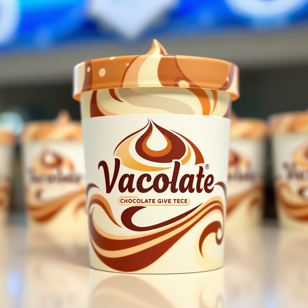
The brand name chocolate vanilla swirl give me a logo give me more realistic
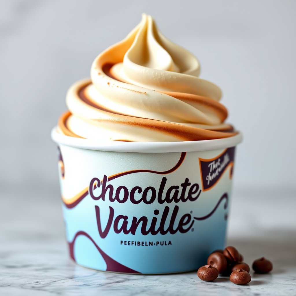
The brand name chocolate vanilla swirl give me a logo give me more
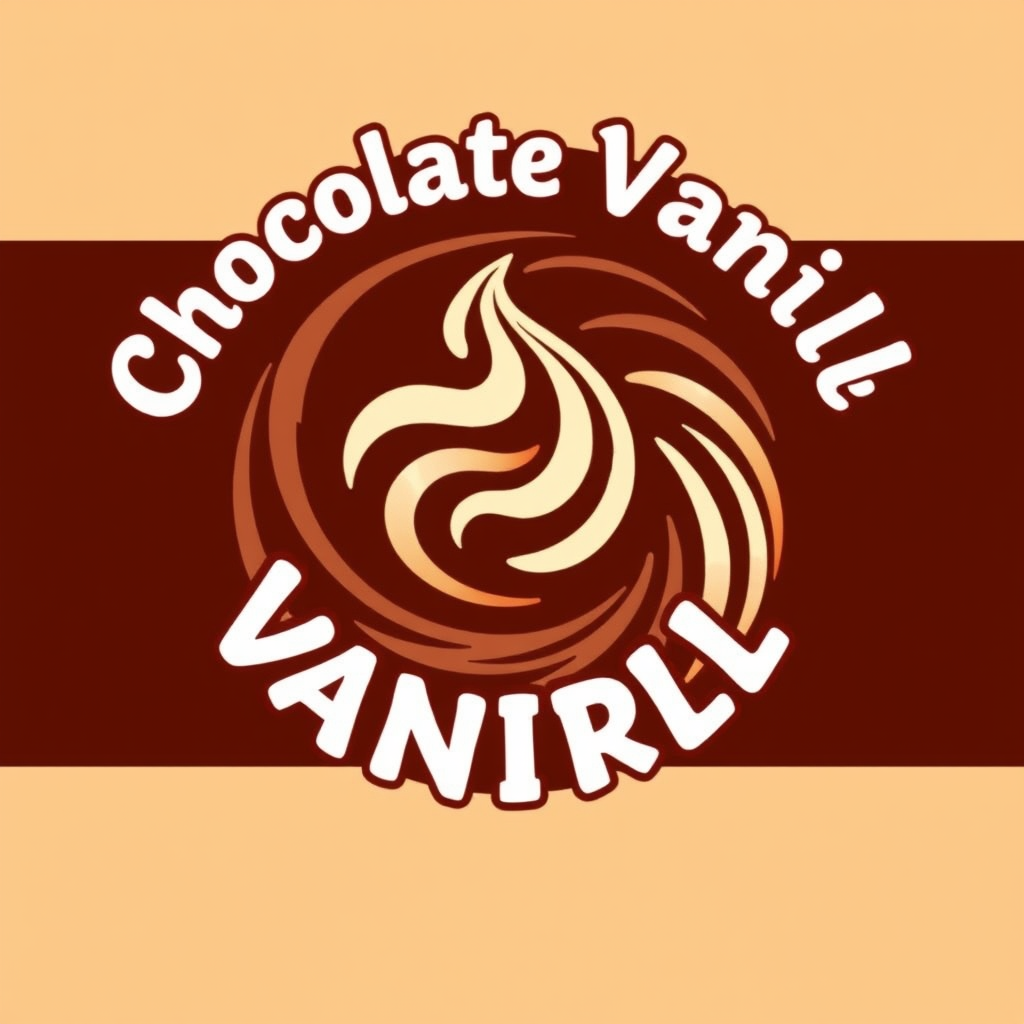
The brand name chocolate vanilla swirl give me a logo
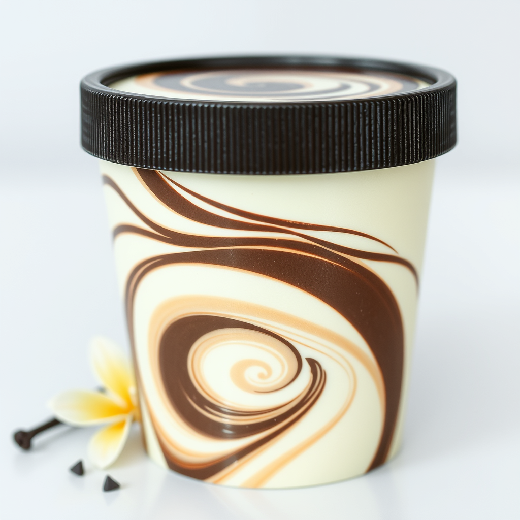
The brand name chocolate vanilla swirl
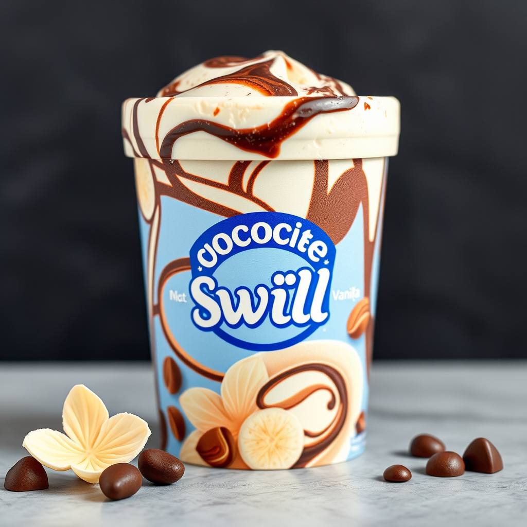
The brand name chocolate vanilla swirl and is a ice cream brand and chocolate brand
my brand name is ''Sky Magic'' and it brand with a sky as the logo
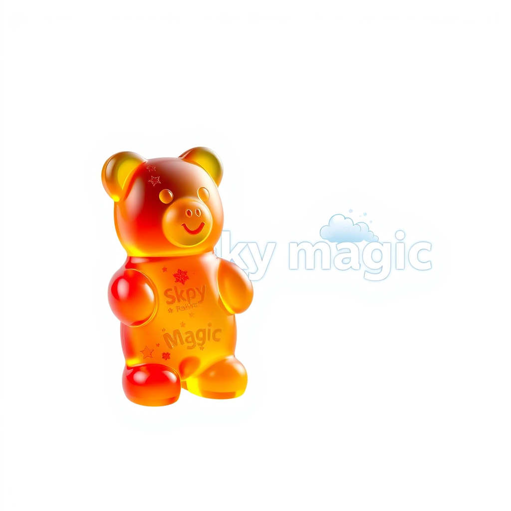
my brand name is ''Sky Magic'' and it is a gummy bear brand with a sky as the logo
Logo épuré et élégant pour la vente de pâtisserie. Écriture de type handwriting des initiales J D bien visibles et donnant un sentiment premuim. Decorations fines et élégante en dessus et en dessous la marque Jadoel Delight en écriture à la main. Le tout en doré sur fond blanc
Logo épuré et élégant pour la vente de pâtisserie. Écriture de type handwriting des initiales J D. Decorations fines et élégante en dessus et en dessous la marque Jadoel Delight en écriture à la main. Le tout en doré sur fond blanc
Logo épuré et élégant pour la vente de pâtisserie. Écriture de type handwriting des initiales J D. Decorations fines et élégante en dessus et en dessous la marque Jadoel Delight en écriture à la main. Le tout en doré
Logo épuré et élégant pour la vente de pâtisserie. Écriture de type handwriting des initiales J D. Decorations fines et élégante en dessus et en dessous la marque Jadoel Delight, logo à gauche. Le tout en doré
Logo épuré et élégant pour la vente de pâtisserie. Écriture de type handwriting des initiales J D en doré. Decorations élégante en dessus et en dessous la marque Jadoel Delight, logo à gauche. Le tout en doré
Logo épuré et élégant pour la vente de pâtisserie. Écriture de type handwriting des initiales J D en doré. Decorations élégante en dessus et en dessous la marque Jadoel Delight, logo à gauche
Logo épuré et élégant pour la vente de pâtisserie. Écriture de type handwriting des initiales J D en doré. Decorations élégante en dessus et en dessous, logo à gauche
Logo épuré et élégant pour la vente de pâtisserie. Écriture de type handwriting des initiales J D en doré.
Logo épuré et élégant pour la vente de pâtisserie. Écriture de type handwriting uniquement des initiales J D en doré. Marque: Jadoel Delight
Logo épuré et élégant pour la vente de pâtisserie. Écriture de type handwriting des initiales en doré. Marque: Jadoel Delight
Create 6 completely different luxury nightclub logos for a Balkan nightlife events page called “BESA BESA”. Use a dark textured background, intense deep-red neon glow, bold high-fashion typography, and a mysterious underground European nightclub aesthetic. Explore different layouts, custom lettering, abstract symbols and geometric shapes. Make each concept visually distinct and memorable. Sophisticated, edgy, premium, minimal, iconic. The exact spelling must be BESA BESA. No mockups, no people, no extra text.
badge logo for Tech icon , bold badge design, text enclosed in a rounded rectangular or circular badge shape, thick border, clean typography, flat vector logo, centered, solid white background, high contrast, professional brand identity

Tommander Keen